
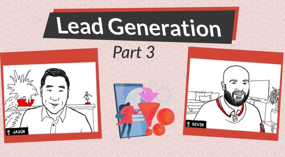
eBridge Marketing Solution’s Devin Rose and Jason Park present a webinar about landing page best practices for B2B lead generation campaigns:
Devin: So thank you so much everybody for joining us for Outbound Lead Generation Part 3 by The Host Broker and eBridge Marketing Solutions. You might have seen the first two parts, the first of which featured myself and Colin Dowling who’s on our team, and we were talking about outbound lead generation. Part two was talking about the type of ROI you can expect from lead generation. And today’s presentation is going to be really interesting as we’re talking about lead generation specifically as it applies to landing pages.
So you might be familiar already with my boss, Hartland Ross from The Host Broker. Hartland has been doing The Host Broker for quite a while now and it actually spawned out of our other business, which is eBridge Marketing Solutions. And The Host Broker is a brokerage for MSPs, web hosts, IT Service Firms, and the companies that play in the IT Services space. So, we have been bringing buyers and sellers together for over 15 years. If you’re interested, please visit www.TheHostBroker.com where a free evaluation is available.
You may also be familiar with me. My name’s Devin Rose and I’m the Vice President of Digital Marketing for eBridge Marketing Solutions. We’re a boutique marketing agency that serves many of the same types of businesses that The Host Broker does. So, IT Service Firms. We’ve been doing this for 20 years, I’ve been doing it for 7 years so we’re experienced in this space and understand the sort of marketing tactics and strategies that work for B2B technology companies and those that don’t. We’re a full-service marketing agency and you can find more information on our website which is www.eBridgeMarketingSolutions.com.
And we’re pleased to be joined today by Jason Park, who is my colleague at eBridge Marketing Solutions, and our web designer/developer, and also an accomplished digital marketer in his own right. Jason, do you want to take a moment to talk a little bit about yourself?
Jason: Sure. Originally, I’m originally from the East, from Toronto. I moved to BC about 10 years ago. I started off and basically have done web development and digital marketing for over 15 years. I started off as a graphic designer way back. So, I have design experience as well as business experience. So what I like to do is marry the two and hopefully, I can speak to business goals and express them through design. So digital marketing has been a passion of mine for a long time and trying to get more leads to websites and such. Also, I’m into pop culture and comic conventions. So if you have any questions about movies and stuff like that, let’s chat. Yeah, that’s it. So, I think I’ll bring it back to Devin. And we will get going with our presentation.
Devin: Sure. If you don’t mind, I’ll apply a segway here. I didn’t realize that in a previous life, you had been a publisher of comic books yourself, and I think that ties into our presentation a little bit today because one of the things about landing pages is that you put it into your brand story, and storytelling is becoming more and more important in marketing. So, having that background will be beneficial for having today’s discussion as well.
Jason: Oh, for sure.
Devin: Okay. So, let’s get into it.
So, from a broad stroke, a landing page is a page that you should be using in advertising campaigns. And what are they for? Well, the main thing that landing pages are for, at least in my opinion, is going to be in relation to conversions. Jason, how do you see it?
Jason: A landing page is when you have a specific goal or offering in mind to attract new customers with.
Devin: When should landing pages be used compared to a regular web page?
Jason: A regular web page usually has more than one call-to-action on the page, where the user or visitor can click on many different areas. A landing page is for a specific action, usually you have only one call to action there – could be either to, for B2B, contact sales rep for a demo, for B2C it could be “buy now” or download a PDF file and such. So, it’s usually linked to one action.
Devin: Got you. So if I’m understanding you correctly, landing pages are for advertising campaigns and that’s where they are mainly used. So, maybe we can contrast for our next slide here what landing pages are not meant to be used for.
Jason: They’re not meant to be used for SEO, the reason being that they typically come with no navigation on the page. And they’re not really meant to be found using search. It’s typically created specifically for advertising campaigns. So, for example, if you have a Google ad or a Facebook ad with an offer to it, it will specifically link to that specific landing page. It can’t be found in the navigation of the main website.
Devin: So, if I go to the website, I’m not going to be able to find it but if I go through or click through from an advertising campaign, I’m going to land on it. That’s the idea, right?
Jason: Yeah. It could be from an ad, an e-letter campaign, or anything.
Devin: Got you. And so, what makes a good landing page? And what separates the good landing pages from the bad ones?
Jason: So, in the end, you really have to keep the audience in mind and who you want to target. So, figure out your persona or the target market that you want to attract. Understand their pain points and the best way to build it out is to have a unique selling proposition right at the top. And emphasize the benefits of your offer and provide value to the person visiting the page. That would make an ideal landing page for them. The more relevant, the more words you use that address their pain, the more likely they will click or fill-up the form for what they’re looking for.
Devin: And in terms of the content that goes on a landing page, does it tend to be shorter or longer? Do you want more content or less content?
Jason: That’s a good question. It depends on what you’re trying to achieve and where the visitor is in the funnel. If you’re trying to attract customers who have not seen your product or service before, who don’t know that you exist really, and you’ve attracted them through an ad, typically it would be a longer page that has more information about who you are and how you can help them. If it’s something where they already know about you and your business and they’ve visited your website before, it could be a shorter page that’s more offer-specific.
Devin: Makes sense. So you want to have some sort of relevancy to the context as to who’s finding the page, figuring where they are in the sales cycle, and tailor the content around that. That seems to me to be a really good strategy. Are there any other elements that come to mind for what makes a good landing page and what separates a good landing page from a bad one?
Jason: Yeah. Going to landing page specifics, having a great hero image that gives a positive feeling, listing benefits right about the fold, having a call to action about the fold – now, this doesn’t actually need to be the lead generation form. You could have that there or a button that leads to it, that lingers nears the bottom of the page. Having some sort of social proof helps – having testimonials or listing how many people are using your services if you have a SaaS software, how many people have signed up for it. Make sure that you have a good call-to-action as well. More specifically, “submit” is not as enticing as “Yes, I want to” or “Please send me this offer”.
Devin: Right. Be direct with your call-to-action and get right to the point.
Jason: Yeah.
Devin: And that goes back to the purposes of landing pages in general. If the purpose is to really improve conversion rates, you get the person’s information, and especially if you’ve paid to get them to your website in an advertising campaign, you should feel entitled to get their contact details or to encourage them to complete the call-to-action of your landing page. And I mention this because I know when I’m talking to tech companies, I don’t know if you’ve had the same experience, but I find that tech companies are sometimes apprehensive to be direct in their marketing. They want to be softer, which is smart when you’re dealing with technical people because technical people don’t like pushy salespeople. But I do think there’s a balance to be struck. On something like a landing page, you need to be sure that you’re aggressive and going after what you want. Obviously, you don’t want to be rude or anything but don’t be scared to have a call-to-action that is direct and to the point.
Jason: Yeah. And you’ll be surprised that people actually appreciate that. Usually, people that have found your landing page and have found your ad, they actually have purchase intent and they want to find out more about your business. And being very direct and specific helps. There’s a lot of noise out there. So the more simplified and clear the call to action is, the better conversion they will get.
Devin: Yeah. Sometimes people might come to your page and may not disclose their contact information if there is too much content on it or if the call-to-action isn’t obvious enough. Maybe they get distracted, right? That’s another thing. You want to strike while the iron is hot, to use a cliché, so I think that’s an important part of a landing page too.
So, obviously, eBridge specializes in B2B marketing, especially for technology companies. And B2B landing pages have a different goal than B2C landing pages where we’re selling to consumers. Jason, how do you feel, how would you characterize a B2B landing page and a B2C landing page?
Jason: So, let’s talk a little bit more about B2C. For B2C, the typical call-to-action would be to either sign up to the mailing list or sign up for a specific offer. Usually the form on that page would be very simple. It could be as simple as name, email and then “submit”. So the goal of B2C is just to obtain that email address and they could send further marketing information or an offer to fulfil the promise of the landing page. For B2B, usually the goal is to qualify them as MQL, a Marketing Qualifying Lead so that you could send them to your sales team to further close the deal. So, in B2C the deal could be closed as quickly as clicking on a “Buy now” button on the page and they can purchase online. But in B2B, it typically involves speaking with the sales staff. So the call to action could be “Fill up this form”. It could be a longer form and that’s actually a good thing for B2B because it makes sure that you have someone who’s serious and has interest in your business. So the goal of B2B is usually to book a demo, contact our sales team for pricing, and things like that. And that way, you can actually send them to your sales department to close the deal. So that’s the difference between B2B and B2C.
Devin: Yeah. So, for B2B you capture the contact information, typically there’s nurturing from the sales team until they’re ready to speak, yeah I totally agree.
So let’s talk about a specific example. This is a landing page that I got from Unbounce’s samples. So I’ll talk a little bit about Unbounce in the comments slide but it’s a good landing page tool. This is an example of a B2B landing page. So I’m thinking we can walk through the various elements here.
So, at the top of the page, as Jason alluded to before, you have a short amount of text above the fold that gets right to the point about the value proposition. On the right-hand side of the page, we have a Contact Form which, in typical B2B fashion, is not only requesting the email but also is requesting job title and further contact details. Jason, what else are you seeing from the screenshot of the top of the landing page?
Jason: Right off the bat, you’ll notice there’s no navigation at the top. It’s to remove, what you’d call any other leakage of leaving the landing page. So really, there’s only one thing you can do, which is to fill-up the form. That usually drives up a better conversion. Right after the value proposition in the title, there’s a short paragraph and also some bullet points in terms of the benefits of what you’re offering. And basically, the reader sees what benefits them and what they get out of it from the perspective of what they need. So the more you address their pain points and needs in saying “If you want this webinar, this can address these solutions”, the better conversions that you’ll get.
Devin: Yep. I want to elaborate a little bit on what you brought up about there not being a top navigation bar there. So I think that’s a main difference that separates landing pages from normal pages and I think it’s counter-intuitive why that is in place to people unfamiliar with landing pages. Because generally speaking, it’s good digital marketing practice to have interlinking on your website for SEO purposes. We’re taught this as marketers and it’s common sense that you want to link relevant pages when necessary on your website and that includes having a well-laid out top navigation so that people can find what they want. So it’s quite a change from that thinking for a landing page. But it goes back to what’s the purpose of a landing page? It’s to get conversions. So, if you were to have the top navigation at the top of the page, that’s just giving people options to do things that aren’t what you want them to do. All you want them to do is enter the contact information and click “Register”. We don’t want to give them any other options that they can use to procrastinate on or navigate the site. No. We’ve paid to get them to this page through an advertising campaign and we’re entitled to get the contact information. So that’s why we have the single call to action and no top nav.
Jason: Yeah. And I think the keyword there is “paid”. Since you’re paying for them to get to this page, you want to see some sort of ROI on your advertising efforts. If you’re using a landing page more at the top of the funnel trying to build awareness, that might not be the right strategy to use because you’re paying for them to come in here.
Devin: Yep. And another side benefit to mention here, and this isn’t the main reason to use landing pages but it is a side benefit, is by having a more direct connection between the advertising campaign and them disclosing their contact information, you’re better able to track results of your campaigns. So let’s contrast that for a different situation where maybe if you send them to your Home Page instead, and maybe they click on a few pages and navigate away, maybe they come back the next day, they find the Contact Us page and they finally reach out to you, it’s going to be difficult to track that Contact Us page back to the advertising campaign that first introduced them to your website. But if we have, like in this case, only one step, when they’re landing on your landing page and disclosing their contact information, even the most basic conversion tracking tools are going to be able to measure that accurately. And it’s a great benefit for companies that are doing advertising campaigns at scale where there’s room to A/B test and optimise, to have that measurability. So that’s another side benefit.
And so, Jason you mentioned earlier about having a nice header, hero image…it occurs to me that not everyone may know what a hero image is. So do you mind talking about the hero image in this photo here?
Jason: Yes, sure. So, it’s typically a large image above the fold. Above the fold means before anyone needs to scroll down on the page, so when the page first loads. In this case, the hero image is behind the copy, that shows a restaurant or cafe. Something relevant to your business to people would be an ideal image.
Devin: So, for this one, I’m not sure it is the best image. I think it looks nice but I don’t know if these look like students, I don’t know if students are going to be the target market for billion dollar revenue companies. So that might be a constructive criticism here – well, it looks nice but it’s not super identifiable to the target market. I’m also not a big fan of the white text over the guy’s white T-shirt…that’s kind of nit picky.
Jason: It’s hard to read. So, any kind of friction, such as having to squint or not being able to read the copy, will reduce the amount of conversions on your page. Some people might not like that style and they’ll just click away. That’s why we also encourage A/B testing, meaning having different versions of some sort of elements on your landing page if possible.
Devin: Totally agree. So, let’s move a little bit further down the landing page.
Landing pages do tend to have…they can be longer pages. So, the second blocking section that we have below the Hero image/Contact Form is testimonials. I wanted to point this out for B2B in particular, your testimonials are huge, they lend to social proof and social proof is really important in B2B as it is relationship-driven thing. So I like that this landing page has that. A note for MSP clients though – you have to be cautious about displaying your testimonials on your websites. Unfortunately in today’s ransomware world, a tactic that ransomware people have been using is to go on MSPs’ websites and look at their testimonials, knowing that the companies that are listed have a relationship with the MSPs. So the MSPs will be on the hook to fix the situation, and they’re more likely to get the ransom out of the MSP than if they went after a random small business or something. So, just be careful with your testimonials. You may not want to disclose the company name, you may not want to use the first name of the testimonial. I would even suggest doing a reverse image search on the photo to make sure it’s not the person’s LinkedIn photo or very easy to identify, because we’ve heard some horror stories from MSPs who’ve had this problem. To the extent that when governments put out RFPs for managed services, and the RFPs are public information because they’re for the government; if those proposals had testimonials on them, ransomware guys are going after those. So that’s how granular they’re getting. So it’s definitely a serious problem and I wanted to take a few minutes to talk about it. It’s actually a problem for which we are trying to work out a solution. But it’s tricky. So for now, I think the best thing to do is just to not disclose the person’s full name and their company name.
And just at the bottom of the page too, the typical element that you’ll find in landing pages is that at the bottom there’s a strong call-to-action. So, Jason, what do you think about this call to action, “contact us today”?
Jason: Yeah, I think it’s very specific. The more specific, the better. This will most likely click back, either go to the Contact page or anchor right back up to the form on this page. Ideally, it would anchor right back up so people would stay on this page. And again, there’s only one action that you want people to take.
Devin: What are some other calls to action that B2B marketers could consider here?
Jason: In terms of the copy itself?
Devin: Yes.
Jason: “Book a demo”, that’s a typical one. “Contact our Sales Team” is a good one as well.
Devin: For MSPs, it could be “free evaluation” or “free security audit” if that’s something that you offer. Another one that I’ve seen recently that I quite like is “Let’s go” – really short and to the point. It’s a terminology that’s used more and more in a sports context. That’s one I like as well. Generally speaking, the characteristics of the text that you should put on your call-to-action is that it should be short, to the point, and pertain to a specific action. So, “Contact us today” certainly meets that criteria just fine.
So, which tools can be used to make landing pages? And Jason, we already mentioned Unbounce in passing here. Do you mind elaborating on Unbounce and mention a couple of other tools that might be used for landing page creation?
Jason: Sure. Unbounce is an online software that is specifically designed for landing pages for a lot of companies and an advantage is that it’s very easy to design through there and it has some great analytics tracking behind it. Some other sites and software that can help you with landing pages are Instapage, HubSpot has a great landing page designer, Squarespace also if you want to use an easy page-builder, that’s another option. Most sites though are built on WordPress. You can use your own page-builder or template, they usually have a template for a landing page that doesn’t have a top or bottom navigation that you can integrate into your site. One advantage of using WordPress or your actual site is that all the pages are sitting within your URL which makes it easier for tracking conversions and goals in your Google Analytics. If you use Unbounce and some other pages, you’ll be physically on a different URL which makes it a little bit hard in terms of attracting.
Devin: Yep. 100%. And there’s probably, for most companies, there might be a variety of options that might make sense as far as what tool to use. So, for instance, you mentioned HubSpot. If you use a HubSpot landing page, the benefit is going to be that it ties into everything that HubSpot offers in terms of automation, lead score and all that. Maybe you already have the contact in your system and they’re coming to your site a second time, you can incorporate that into your lead scoring, and know that person is really a hot lead. So, if you’re using a CRM or automation tool like HubSpot, it probably makes sense to use their landing page tool. Another factor too is that some other tools that Jason mentioned – Unbounces of the world, there are service fees associated with those. So, for instance Unbounce starts at above 80 dollars per month. So you don’t start breaking the bank but it’s the way software as a service tools go. They tend to add up, with the more of them you have. So, it’s something to be mindful of.
For using WordPress and a plugin to create the landing page, WordPress is likely going to be the most cost-effective option. And as Jason mentioned, it’s easier to get the basic tracking incorporated compared to other tools. You may not be able to get as nice designs with Unbounce and HubSpot but that’s my assumption. Jason, what are your thoughts? Is there a variety of quality from these tools? Do you expect the same quality? What are your thoughts?
Jason: Quality-wise, WordPress has come a long way. There’s a lot of designs out there that are comparable to Unbounce in terms of quality. Really, it’s about how well you can integrate within your ecosystem of tech. So, if you’re already on WordPress, you might want to explore other plugins or your own page builder. If you’re on another system, maybe Unbounce might make it easier for you to create the page. So it’s really your internal knowledge base and how quickly you can get it out there.
Devin: If it was your company, Jason, which tool would you tend to use for landing pages?
Jason: We build through WordPress. So, basically we would probably use WordPress. And again, you don’t have to do anything additional to get the tracking tool to work. So that would be my preference. Besides that, I would use something like Unbounce.
Devin: Got you. And the nice thing about Unbounce is that eBridge is a Vancouver, BC-based company, just like Unbounce. So we have to give them a bit of a shout-out and some credit here, support the local tech scene.
And in terms of the effectiveness of landing pages, this question is difficult to answer in terms of broad strokes because it is so specific about the nature of the business, the website in particular and countless factors. But I’ll talk a little about a rule of thumb regardless. So, for a landing page for B2B, a decent conversion rate is going to be in the neighbourhood of two and a half to five percent. It can definitely be lower or higher than that, not drastically higher. That’s the neighbourhood you’re going to be in. If we compare that to the conversion rate of a normal landing page, it’s probably going to be closer to half a percent, if the call-to-action is to get them to fill the Contact Us form, maybe even lower than that.
Jason: Did you mean them more like a web page?
Devin: Yeah. A normal web page. Sorry, not a landing page. Just a normal Services Page or something like that, just the average page on your website. It’s going to be half a percent. So, as a rule of thumb you could say that the conversion rate for a landing page compared to a regular web page is about 5-10 times higher. So, obviously if you’re getting 5–10 times more results on your campaigns, these are worthwhile to do. Sometimes, I do run into clients who feel apprehension about creating landing pages. They feel like it’s unnecessary and they don’t understand the benefits of it. Jason, I’ll come back to you, but I feel that given the 5–10 times performance can be expected, there is a cost associated with these landing pages, but as long as your campaigns are spending a decent amount, they do add enough value to make them worthwhile most of the time.
Jason: Yeah. So, it all boils down to what are the business goals of the company. If the goals are to increase the number of leads on a monthly basis, having an ad is just half the battle. Having a great landing page or a page that converts is the other half of the equation. And if you have great ads that people can click on and also a great landing page where it actually converts, that’s when we have the magic formula. A lot of people discount the webpage part of it. They think that a typical Contact Us page or Service page with something on it might be good enough. But we see time and again through the data that we collect through analytics that having a specific landing page converts more. So, why not have a specific landing page since you’re spending a lot of time creating campaigns anyway. So we want to make sure that you get your ROI.
Devin: For sure. And one thing that we can mention here too is that an effective way to look at landing pages is, and I’m thinking about MSPs here where quite often a few MSPs might have a few different geographic markets they’re targeting, obviously not too broad for most of them, but there might be a few different municipalities. So, maybe you have advertising campaigns targeting those individual municipalities. Well, you could create a template where it’s the same landing page but at the top, you just change the name of the municipality. So, I’m in Vancouver as an example. Maybe we have Vancouver Managed IT services and then Richmond Managed IT services, so you create a template and the page is the same except for that one thing – the name of the municipality. And that can be a very effective way to do it. So, going back to the very start of the presentation – storytelling, having that continuity between clicking on the ad and landing on the landing page so that it carries forward the information from the ad, that makes it a kind of conducive story or situation for them; they’re more aligned. That’s a method that we recommend.
Well, that was everything that we have today in terms of the planned question and answer. And if there are any questions from the audience, we would love to field them at this time.
Maybe I’ll just take a second here while people might be asking questions. If you are joining us from YouTube, please feel free to click the Subscribe button below. That would be great. We are putting out these videos about once every 3 weeks or so. So, that would be great.
I see Anna raising her hand. And one second. Anna, I don’t know if you’re able to respond. I think I just gave you the microphone.
Anna: Testing microphone?
Devin: Hi Anna! How are you?
Anna: Hi! I’m good. How are you? My question is about the testimonial section.
Currently, in the Home Page, we’ve designed a dedicated section at the bottom of the page that has testimonials. I actually did some research on Unbounce too and saw that it’s kind of better to just sprinkle around the testimonials across the Home Page as opposed to having a dedicated section. How essential is it to redesign and remove that, like the testimonials at the bottom of the page in favour of sprinkling it across the let’s say, Home Page or whatever the landing page is or carrying that section over from the bottom to let’s say, below the Hero image? What are your thoughts?
Devin: Jason, you might have some additional thoughts. My first thought is that there are probably different ways to go about it that would work fine. So, it’d be worth A/B testing, my gut instinct is saying that the position of the testimonial on the landing page isn’t probably going to have a drastic impact. So stick to the main rule of having the main value proposition at the top of the page. There are different ways you can go about organizing the sections below. So, I’m not sure if the specific order is going to have a huge impact on conversions. But generally sprinkling testimonials throughout the website is a great idea. We definitely recommend that. I would just draw the distinction again between a landing page that isn’t typically able to be found on your website versus a normal webpage which would be. So, it’s a little bit of a different objective I suppose. Jason, do you have any thoughts on that?
Jason: Yeah, for sure. So, the Home Page is really interesting because you’re trying to meet many objectives by many different audiences. So, you want to make the new visitors happy by offering the proposition and the benefits right away and have testimonials just to show social proof for them. For people who know your company, who have visited before, they want to take action right away. So, having a button that says “Contact Us Right Away” will satisfy them. And for them, it may not be as important for testimonials to be higher up because they already know you. So I think that’s what Unbounce was saying; depending on the audience that you’re addressing, if you gain a lot of new visitors then maybe having testimonials a bit higher up on the page could be beneficial, again to show social proof so that people trust.
Anna: Okay.
Devin: Yeah. And I would say that the more testimonials, the better, right? They’re huge for B2B. So, throughout the website, the landing pages, and other marketing materials and even printed marketing materials, they’re beneficial. Did that answer your question, Anna?
Anna: Yes. And I have another one.
Devin: Sure.
Anna: For the Book A Consultation page that is quoted into the website, that is not a landing page that the prospect is landing from the ad, you’ve talked about removing any extra navigation so that it’s very focused and the prospect is not distracted…so the Contact form, request consultation form that is embedded in the website and is a part of the Menu navigation, is it a good idea to remove from the Home Page or from the Blog Page whenever a prospect clicks the CTA button and is taken to the Contact page…is it a good idea to remove all those extra navigations to keep it all to the point for them to fill out the form, or keep the design?
Jason: I get it. I can field this one. So, what I’ve seen a lot of MSPs do, a lot of tech companies do, is they separate the Contact form from Book a Consultation. A Contact form is typically in the navigation and the goal of the Contact form is to field any outside questions, right? Not necessarily booking a consultation – that’s a specific task that you should separate out from the Contact Form, ideally have a separate page for. That page I definitely recommend…it’s not 100% necessary if they’re coming from the website but you can have that navigation, it’s not 100% necessary again because it’s linked from the website itself. But I do recommend separating a Book A Consultation from the general inquiries contact form. From there, you may want to field only people who have questions of employment or something else, besides booking a consultation. And that way you can actually separate out the goals and make sure that the visitor understands that when it’s Book A Consultation, there’s specifically a form for that, and you can track your goals better than a general Contact form.
Now, if you’re stuck with having a Contact form, then I do recommend at least a dropdown menu that states the topic or subject. So, maybe Book A Consultation may be one item there. The general rule is that if it’s on the website, there’s a link and it should have the navigation on there.
Anna: We do have both Contact Us and Book A Consultation as part of the menu. They are also part of the call-to-action buttons throughout the web pages and blog pages.
So, in this situation I heard you about the Contact page, so we keep the navigation. What about the Request Consultation page? For example, if on the Home Page, it’s part of the menu, you click on it…is it better then to have just the information relevant to the Request Consultation while removing the Menu bar just on that page? Did I ask that correctly?
Jason: Yeah. Well, here’s a strategy I would recommend. If you have a Book A Consultation page specifically and in the navigation, I would keep the navigation there for that. What you can do is also create another specific Book A Consultation page without the navigation, then use an ad to point to that, and on that Book A Consultation page there’ll be a bit more detailed information that’ll be tailored to who you’re targeting as well. So, it could be specific for an industry, for example. So, let’s say, you target a specific industry, you can have a Book A Consultation page for a specific industry and have an ad for that and a separate page. Now, having more than one landing page is a good thing. Having multiple landing pages allows you to segment who you want to target with it with marketing.
Devin: This is a great discussion point. So, thanks for bringing that up. And the thing that comes to mind for me – why do we get rid of the navigation for a landing page where we’re trying to get the contact information, but not for a page that’s on the main site? For me, it just comes down to the expectation of the visitor of the site. So, if somebody clicks on an ad and they’re sent to a landing page, and I think most people have had that experience now, they’re accustomed to it, it’s not really strange. But if you happen to be on a website and you click through a section and after you’re browsing the website for a little bit, then suddenly you’re not able to go backwards, I think that would annoy people. I think that’s going to put the wrong taste in their mouth, like “Oh!” Well, actually the term is dark patterns, right? That’s the trendy word that you hear a lot. Marketers try to get you to do a little action, it’s kind of underhanded towards getting sales, I would be worried about, it’s almost like a bait and switch sort of feeling to give to the visitor. But I don’t think that the same feeling applies if you click on an ad and land on a landing page. So, to me at least, that is the big differentiator.
Anna: Great. Thank you! I do have another question. (laughs)
Devin: Sure!
Anna: You brought up a point about segmenting your audience when clicking on a Request Consultation form from an ad. How would you do that?
Devin: So the segment would be aligned to the campaign settings. You might have a different ad group or a different campaign targeting different segments, and then in the Campaign Settings you would customize the landing pages’ URL to direct towards the one that you want. For instance, let’s say your main market is greater Toronto and then you’re also going out to… oh I’m not going to show my Ontario geography very well here (laughs)… but let’s say a secondary market was like Thunderbay or something ( 1:07:52), okay? It’s probably very far away and a bad example. Regardless, you could have the same landing page for both Toronto and Thunderbay with the only difference being the name of the municipality and the URL would be different. You could have corresponding ad groups for those municipalities too that utilize that landing page.
Anna: Oh yes. So, it would be the same landing page just used for different ads. I thought it would be kind of a different Request Consultation page, depending on the industry, geography or segmenting.
Devin: Know what’s a cool thing that you could do, which isn’t a ton of work, but in addition to the change at the top of the landing page, maybe you change the hero image. Maybe for Toronto, it’s the CN Tower or something like that, right? And maybe for a different municipality, maybe in Thunderbay the Terry Fox statue or something, just something that’s really identifiable to the people who are from that region.
Anna: Okay.
Devin: That would be a good way to…
Jason: You can segment by geography, which is a good tactic. You can also segment based on the industry, that’s a little bit more difficult, depending on which type of campaign settings you have. It’s a little bit easier to do on Facebook ads than Google Ads. And also, you have to make sure that if you create a landing page that is for attracting hospitals in Toronto and attracting the mining industry or something, you have to make sure that the landing page speaks to each market and their pain points.
Anna: Okay. Great. Thank you!
Devin: You’re welcome and just another thing I want to mention too, Jason, actually I think it was the previous question but you were talking about the navigation on landing pages on the site, how you can have a Contact Us page and then reutilize it for a landing page as well and Jason you had mentioned to me earlier, before the webinar that there are some plugins for WordPress that will help you strip away the navigation. So would you mind elaborating a little bit about how that works?
Jason: For sure. In WordPress, if you use a page builder, they usually have a template called a Blank Page. So you can actually use that to build your landing page on; it does not have the header or footer in there. So it’s easier to create a new page. There are also other plugins that are specific for landing pages you can generate for and there are drag-and-drop tools for you to create them. So, there’s a lot out there. All you have to do is search for “landing page plugin WordPress” in Google and you’re good to go.
Devin: Great! Well, thanks so much for the questions, Anna. That was great. And thanks everyone for attending. If you’re interested in getting in touch with Jason and I, here is the contact information for eBridge Marketing Solutions and The Host Broker. And as I mentioned, if you’re watching on YouTube please subscribe. That would be much appreciated. And that you very much for your attention. Have a great day!
Jason: Take care!
As eBridge’s VP of Operations, Devin Rose brings marketing expertise and an entrepreneurial knack to the eBridge team. Devin holds a Bachelor of Commerce Degree from Royal Roads University and a Marketing Management Diploma from the British Columbia Institute of Technology.
Posted September 28, 2021
Categories: Advertising and Marketing General,
Webinar
Tags: B2B Lead Generation, Lead Generation